Design Systems with a Twist
Scaling a living system adopted across 40+ apps
COMPANY
-
SERVICES
Product design, Design system, Accessibility

The challenge
- The team was moving fast but lacked structure.
- Components were duplicated,
- UI patterns were inconsistent, and developers were building everything from scratch.
- Developers needed a shared language and designers needed guardrails.
The result was a fragmented product experience and slower delivery.
My Role & Scope
My role: Lead Product Designer
Scope: Audited established design systems (including Shopify’s and major store themes) to define a tailored approach to spacing, color, and typography; built Figma components and tokens; documented naming conventions; partnered with engineers for implementation
Result: System adopted by both development teams; improved consistency, accessibility, and design–dev handoff; reduced design debt by centralizing and updating core components (buttons, variant/quantity selectors) across 40+ apps
Timeframe: 2 years (ongoing work alongside product and marketing initiatives)
Process
Step 1 – Audit & Alignment
Benchmarked inconsistencies, studied Shopify + competitors
Step 2 – Foundations
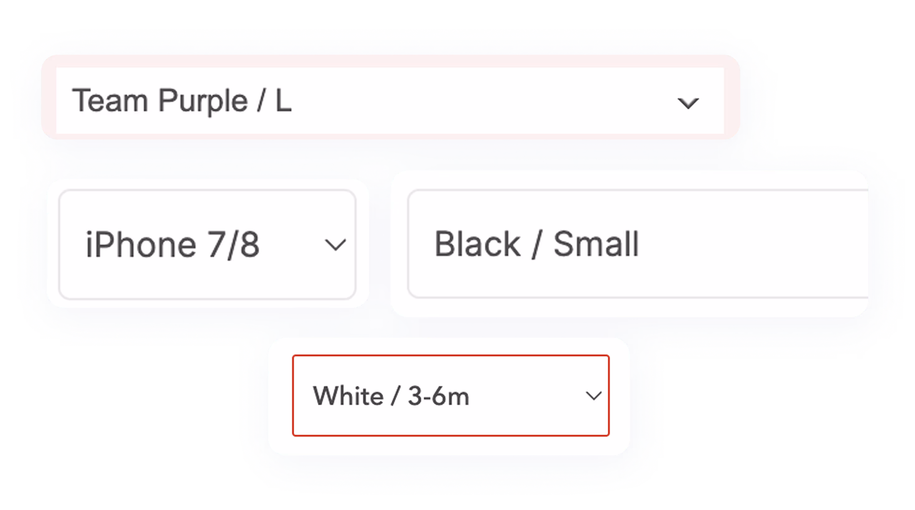
Tokens (spacing, colors, typography)
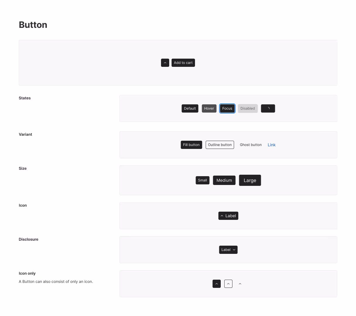
Accessible components (buttons, selectors, text)
Naming conventions aligned with code
Step 3 – Built for Reality
Tested against live product needs
Unified marketing + product patterns
Flexible for experimentation

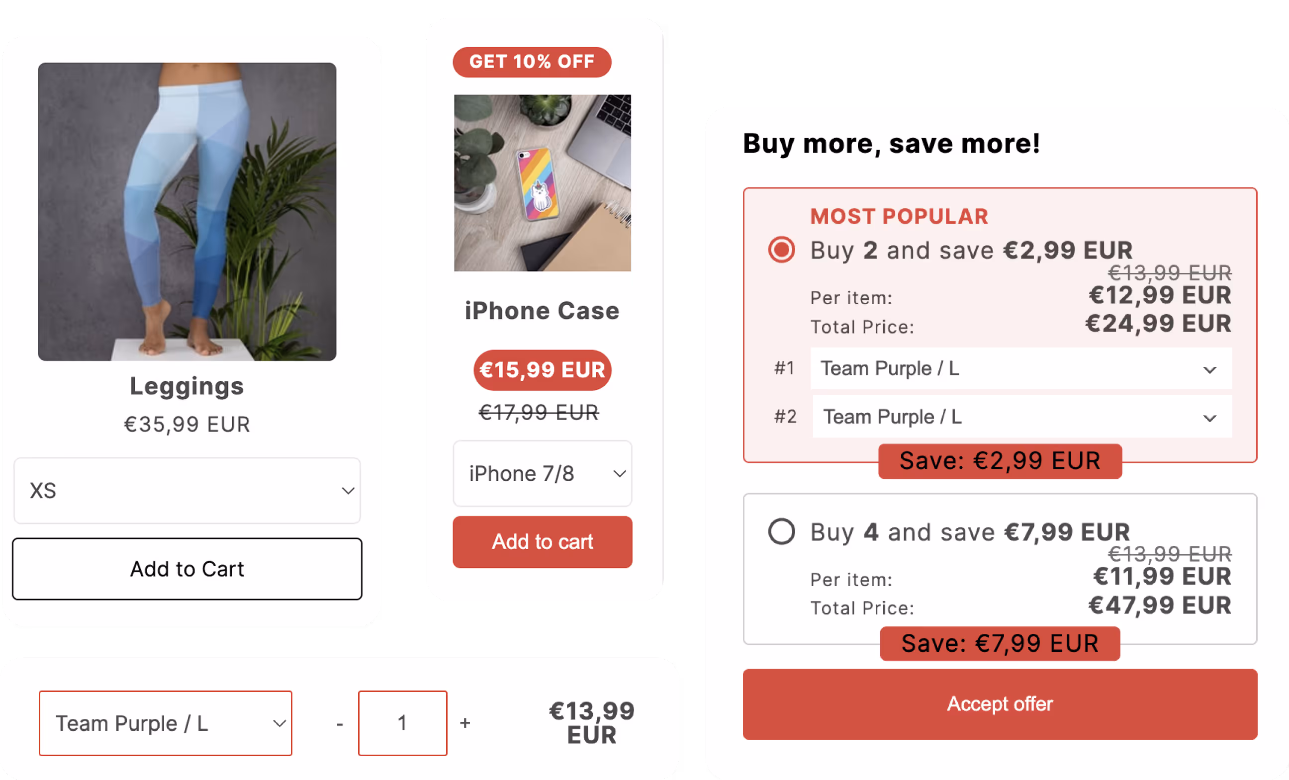
System Foundations
- We followed WCAG 2.1 AA standards for contrast ratios to ensure readability of all text, especially for interactive elements like buttons, links, variant and quantity selectors.
- Created reusable Figma components based on real use cases
- Built visual consistency across multiple surfaces (product, landing pages, and marketing materials)
- Integrated naming conventions that matched front-end code
- Designed with flexibility in mind for experiments and rapid iteration


This isn’t a static library - it’s a living system that scales with us.
Outcome
- System adopted across 40+ apps by both development teams, improving consistency and reducing maintenance overhead
- Centralized key component selectors - making accessibility updates scalable across the platforme and encouraged usage from non-designers and engineers: system continues to evolve as the team scales.
- Improved engineering velocity: reduced design-to-dev clarification and rework by documenting components and tokens
- Reduced design debt: eliminated inconsistent spacing, typography, and color patterns inherited from legacy themes and early-stage chaos
- Boosted internal engagement: naming conventions made the system approachable and encouraged usage from non-designers and engineers
- Still in progress: system continues to evolve as the team scales.